NIMBY Rails devblog 2025-09
Final design for script data extensions in UI
Last month I arrived to the realization that scripts alone, without player accessible and editable data, were a bad idea, and started work on making script configuration data a first class system of the game UI. This is the motivation of struct extensions. As a reminder, this is how they look like in the script side:
struct SignalPrio extend Signal {
    meta {
        label: "Reservation boundary priority",
    },
    // some struct fields go here
}

struct SignalCheck extend Signal {
    meta {
        label: "Probe a track position",
    },
    probe: ID<Signal> meta {
        label: "Probe",
    },
}

struct PathChange extend Signal {
    meta {
        label: "Drive to marker position",
    },
    // some struct fields go here
}
These structs are the familiar struct feature of languages like C++ or Rust, and the extend keyword indicates they extend some game object. Only some game objects can be extended, and Signal is one of them. When the corresponding game editor for that kind of game object detects one or more scripts allow extensions for the game objects, it will offer a new interface to enable or disable said extensions, and allow to configure them:
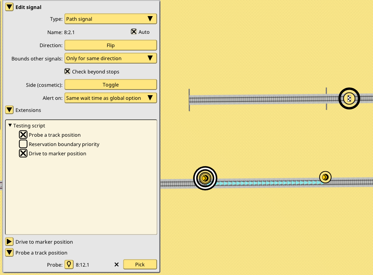
This neatly integrates with the existing game UI. In essence it allows every script to have its own little UI, to configure it for a particular game object. A global script-wide configuration panel will also be provided. For example, a speed setting script could have a global configuration for players to input some default speed, then a per-train setting by using extend Train in a script struct.
Not so final design for how to call script function calls
With the script data binding solved and nicely integrated into the UI, it was time to think more about the script code binding problem. When is a script function supposed to be called? How it is decided a certain script applies to certain object or situation, but not to others? Unlike data bindings, I honestly had no “big idea” for this, so I decided it was impossible to know until I had at least a few real, useful examples of scripting that did previously impossible things in the game.
I am now at that point and the anticlimactic conclusion is, “it depends”. Performance wise I was surprised to discover it was completely fine to spam calls into scripts, even doing silly experiments like calling every function 100 times. There’s really zero overhead compared to a native C++ call. So as long as the script is quick to complete it is perfectly fine to have script calls as fixed global functions, rather than trying to model them as “methods” of objects that only get called when an object is extended a certain struct, which was my second design idea.
That second idea, script functions as dynamic methods (virtual for the C++ fans, dyn trait for the Rust fans), was also tested and it also worked just fine. It might seem this second idea is the good one, but as I will explain in one of the script examples, the concept of every script function being some game object method is kind of limiting, so I’m not sold yet.
Quite final design for when to call script function calls
But what became clear is that the idea of limited scope function calls was the correct one, compared to 1.17 idea of “scripts can modify everything”. I was initially worried at how limiting it could be to have very specific roles for the script calls, but it turns out to be quite liberating. Since script functions cannot modify anything, they automatically become multithread safe (with controlled APIs), for example. Also interesting script interaction patterns emerge, like the vetoing concept I explain next. But most importantly, it becomes super easy to make scripts compatible with the huge existing C++ code base, and by extension by the existing simulation mechanics all saves depend upon.
The idea of the scripts I show next, and how they integrate with the game, is that they do not attempt redefine the core concepts of the simulation. They don’t attempt to redefine what is a signal check, instead they contribute to the existing signal check, and can work along any other scripts. They don’t attempt to redefine what is a train path, instead they return a track position as a new drive destination and let the C++ side sort all the details out. They don’t remove the reservation system, instead they enhance and extend it. And they do so with the most minimal amount of code and function calls.
As I think of more test scripts and experiments, I will keep making more of these function calls available for scripts to implement, and when player scripts are possible new function calls will also be suggested and maybe implemented. But read the rest of the post on how far you can go with just 4.
Script functions for signals and signal vetoing concept
The philosophy of scripting a signal behavior is going to be to add to the existing behavior, not to replace it. Path signals will remain the only signal allowed to stop a train. And it will always perform the path check under the existing 1.17 rules. This path check cannot be removed. But it can be extended. And arbitrary extra checks can be added to it.
This is the “vetoing concept” for signal checks: a script implementing a signal_check function, and extending a signal with a struct, will be called when the signal path check occurs, and can return false to veto the path check. Multiple scripts can be bound to the same singular signal, and as long as just a single one returns false, the path check will fail. In other words, “all lights need to be green for the system to be green”. One of the lights is the default path check, and the other lights are each individual script signal_check call, and the signal does not allow the train to pass if a single light is false (red).
Script example: signal check veto with reservation probe
The first script example is a signal_check which vetoes a train if a certain track position contains a different train (or reservation of a different train). Basically a holy grail of signaling in a few lines of NimbyScript and a dead simple auto generated UI. When this signal extension:
struct SignalCheck extend Signal {
    meta {
        label: "Probe a track position",
    },
    probe: ID<Signal> meta {
        label: "Probe",
    },
}
Is enabled in the track editor signal panel, it displays the UI to configure it:
When clicking the Pick button, the player can then select any existing signal. I picked a balise but there’s absolutely no need for the signal to be “active”. It could be a completely neutral signal like the old platform stop point signal. I will look into introducing a purely neutral signal for these kinds of purposes. But path signal or a balise work just as fine, and depending on what you are doing, are likely a good idea too.
This is the code for signal_check in this script, follow along with the comments:
// when signal_check exists and it has the correct parameters, the C++ side understands this script wants to be called when a signal is checked
pub fn signal_check(db: &DB, extrapolator: &Extrapolator, motion: &Motion, signal: &Signal): bool {

    // this script does not really want to run for every signal tho, so it first looks up the previous SignalCheck
    // if it does not exist, it means the player did not extend this signal in the UI, therefore return true: nothing to veto
    let config &= signal.view_SignalCheck() else { return true; }

    // the configuration exists, so look up the signal object pointed by probe field in the game database
    // if it does not exist (player forgot to pick, signal was deleted, etc), return true: nothing to veto
    let probe &= db.view(config.probe) else { return true; }

    // an interesting API is introduced here: reservation_probe() returns an iterator of all the occupations
    // and reservations in a track position (yes, NimbyScript now has loops and iterators)
    for hit in extrapolator.reservation_probe(probe.pos) {
        // if the probe hits a train, and said train is not the train facing the signal, return false to veto the signal check
        if !hit.train.id.equals(motion.train_id) {
            return false;
        }
    }

    // the loop ended without any vetos, so just return true, nothing to veto
    return true;
}
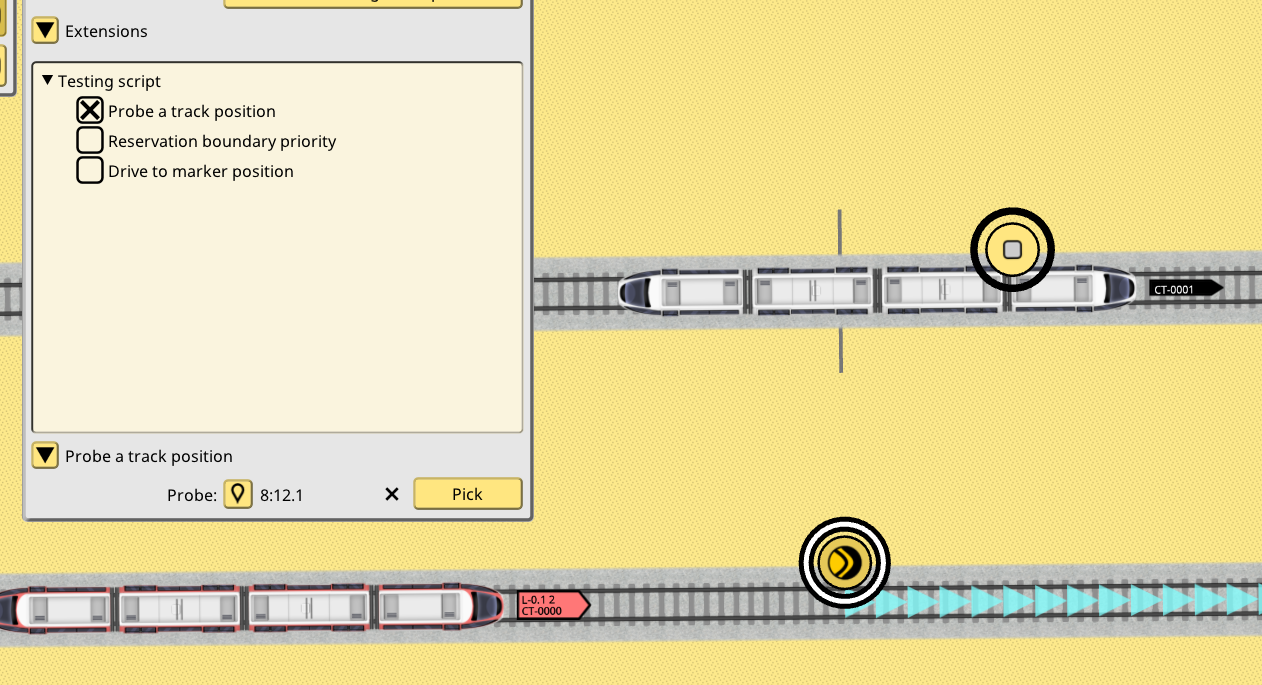
In just a few lines we have added an extra check for reservations on a track point to a signal. Now the signal will be red if this check fails, in addition to the path check and all the other checks it might carry:
Script example: custom reservation boundaries with priorities
It is powerful to add custom checks to signals, but it remains true that the core path signals are built around track reservations, path tracing and path checking. I realized it was also possible to extend this system by following the same rules as the veto idea: no script is allowed to make a reservation or a path check shorter than it would under the core reservation rules, but they could make it go on for longer. By using this capability pervasively, it is possible to have “long reservations” and/or “long checks” without explicitly linking signals together or by introducing custom track probes, like the previous example was doing.
I came up with an idea inspired by some very old (2022?) conversations about reservations. Some idea of giving priorities to reservations on the tracks was suggested, but it was flawed, since it required trains to ignore signals depending on what was being reserved. I rescued this idea for this script example by, instead of assigning priorities to track reservations, assigning them to signals and trains. Reservations on tracks remain identical to the existing system, which makes this idea automatically compatible with every save in every situation, combined with the “can only make things more strict, not less” design principle. In other words, a reserved track is just as impassable as if it currently had 200 tons of steel siting on top of it, and this needs to remain true.
As a reminder, reservations are the idea of storing “reservation” information on the future path of trains on the tracks, and have been implemented since v1.2. Path signals trace the current (and future) train path past the signal, and if reservations are found (or just a train), they flag red. This process needs to remain identical. But what if the “boundary” of the signal path check was customizable? Never shorter than the core behavior, but made longer by a script? A script could be called when a signal path check finds a possible boundary for its search, and then veto to stop the search, or vote to continue it. This idea sounded interesting. Under what conditions could this happen? A script could have any logic to do so: based on train tags, on the line being run, depending on a train struct extension, etc. Going back to the previous idea, I tested this: signals have a priority number, and lines also have a priority number. When a train reaches a signal its future path is checked as usual. If the future path finds a signal, it would normally stop the search. But now the script is called instead, the priority of the train line current is looked up, and it is higher than the priority of the signal, the search is allowed to continue. It will stop when it reaches a signal on the path with a higher priority than the train line.
struct SignalPrio extend Signal {
    meta {
        label: "Reservation boundary priority",
    },
    priority: i64 meta {
        label: "Priority",
        description: "Reservations and signal checks can extend beyond this signal if their priority is higher than this number",
        min: 0,
        default: 0,
        max: 1000,
    },
}
struct LinePrio extend Line {
    meta {
        label: "Reservation boundary priority",
    },
    priority: i64 meta {
        label: "Check priority",
        description: "Trains checking their path at signals will continue checking past signals if this number is higher than the signal priority",
        min: 0,
        default: 0,
        max: 1000,
    },
}
pub fn reservation_boundary_check(db: &DB, motion: &Motion, signal: &Signal): bool {
    let train_prio mut = 0i64;
    if let sd &= motion.schedule_dispatch.get() {
        if let line &= db.view(sd.run.line_id) {
            if let le &= line.view_LinePrio() {
                train_prio = le.priority_check;
            }
        }
    }
    let signal_prio mut = 0i64;
    if let se &= signal.view_SignalPrio() {
        signal_prio = se.priority;
    }
    return train_prio > signal_prio;
}
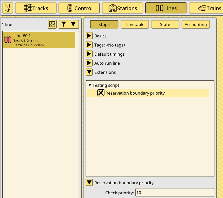
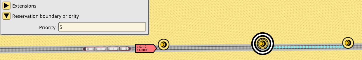
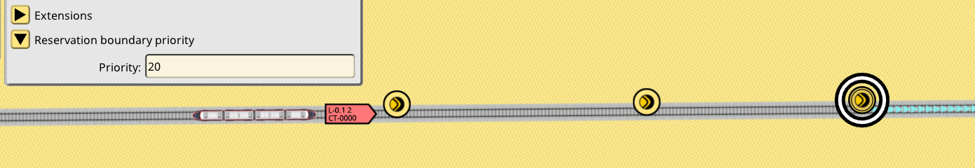
reservation_boundary_check gets called during signal path checking for every possible boundary found (these are usually other path signals or balises). It then looks up the train line and its extension, and the signal and its extension, and returns true if the line priority is higher than the signal priority. Here’s some screenshots to illustrate this. The line has been extended, and the check priority is set to 10:
Three signals are one after the other, the first one does not have any extension:
Second signal has the reservation extension enabled, and its priority is set to 5:
Third signal has the reservation extension enabled, and its priority is set to 20:
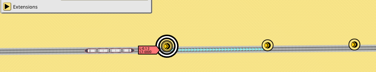
The train is about to enter this section. The train info window path widget has been enhanced with some extra colors to be able to visualize this process:
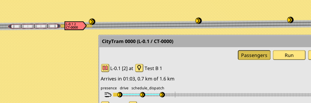
The new cyan line on the train path widget indicates the path check reach of the first upcoming signal on the train path. As you can see, it goes past the first signal: this is to be expected, it is just a normal train approaching a signal situation. But then it also goes past the second signal. This is because that signal priority is 5, while the current train line is 10, so the script allows the path check to continue further. It does end at the third signal, since that signal priority is 20, higher than the line priority of 10.
Another possible extension of this system is to make the boundaries of the reservation also “long”. Rather than always finishing the reservation at the first signal, it could be extended further, using the same check as previous code, but maybe reading a different value. In this example the green train reservation boundary is set to 100, and the signal in front of it is 0:
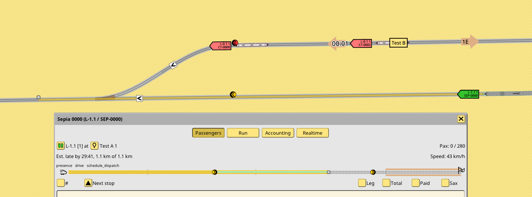
As seen in the screenshot, its reservation has gone past the signal. It is only stopped at a balise past the switch, because said balise priority has been set to 500. The red train is forced to wait for the green train to clear past the switch and balise, despite having the clear way, because the main line has been reserved by the green train. It managed to do so because the main line path signal protecting the switch has priority 0.
To be clear this is just a test script. The idea of using priority numbers for this kind of mechanic might be hard to grasp. A different script could maybe use tags, with hardcoded priority. That could be more understandable than this idea. But the underlying mechanism will remain the same: the script is called when a path check or a reservation boundary is found, and it can decide if the check or reservation keeps going or not.
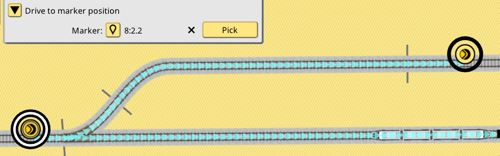
Script example: path change
For the last script test I wanted to introduce train path changing, and that meant new mechanics in the train sim: the capability to change a train path arbitrarily, outside of the schedule system. The stop selection system is already doing something quite similar, but it is restricted to direct trains into scheduled stop areas. I wanted to be able to direct trains to any point in any track, without limitations, and still be able to keep that train in the schedule system (with a corresponding delay of course).
So I started by introducing the concept of a milestone, which is a train destination that takes priority over the current scheduled destination. Once it’s reached, it is deleted, and the train automatically pathfinds towards its scheduled destination, without any more script intervention. While I was finishing this implementation I realized it was not really needed: everything was already in place for this kind of behavior. The only missing step was precisely the last one, trains being able to auto-path while under schedule control. So I was able to trim this new system down quite a bit, to a minimal set of rules and extra code. It all boiled down to this: in 1.18 trains will drive to whatever is the current end position of its current path. If said end position matches the current stop area set of its next scheduled destination, the schedule system gives it a new path and destination. If not, a new path is found towards its current destination. No need for new game objects and systems.
This is super simple but it solves the problem of path-changing signals quite neatly. Signals can just keep giving the train new destinations to drive, arbitrary points on the tracks which only exist for engineering purposes, not for line service purposes, while the train never loses its scheduled stop, and is ready to start pathing back to it the moment these evil signals stop giving it random new destinations.
The scripting side of this idea was a little more tricky. The veto/voting concepts don’t really work. In general it’s not going to be a good idea to have a single signal with multiple path changing scripts running. It will still be possible, if these scripts are tidy and limit themselves appropriately. If not, the game will just pick one and declare it the winner. In general if multiple points of decision are desired to give multiple path changes, these should be separate signals. There is NO “stacking” of path changes, every path change overrides the existing path. The scheduled path system is just one of these “scripts” and it will be always ready to run if there’s nothing else to give the train a path. Stop selection signals are also one more “script” in this context, so it won’t be a good idea to put path changing scripts on stop selecting signals, and script changing paths will override stop selection. Very important!
The path change script is very simple:
struct PathChange extend Signal {
    meta {
        label: "Drive to marker position",
    },
    marker: ID<Signal> meta {
        label: "Marker",
    },
}
pub fn signal_change_path(db: &DB, extrapolator: &Extrapolator, motion: &Motion, signal: &Signal, pos: &mut Pos): bool {

    // like the signal_check example, load up the configuration and marker signal, or bail out if invalid
    let config &= signal.view_PathChange() else { return false; }
    let marker &= db.view(config.marker) else { return false; }

    // pos is an input/output parameter, it is overwritten here with the signal position
    // this is a train destination so orientation is relevant. due to historical reasons
    // path signals have a reversed orientation, so flip it before assigning
    pos = marker.pos.flip();

    return true;
}
The code is unconditional because, for now, the script can only be associated to a path signal, and it is only called when the path check fails. In other words it is only meant to allow the train to change paths when its current path is busy, not for other reasons. I plan on changing this function to be a bit more flexible. But path changing scripts should always be associated to a path signal, because changing a train path means a new set of reservations, and so it would easy to make a mess if there’s no way to stop the train when these new reservations are busy too.
Here’s an example of a signal extended with the script in the UI. It is very similar to the signal check script. Some arbitrary signal is picked to become a marker on the tracks:
And here’s a video of the script in action:
Debug tools
To debug these scripts I implemented a couple new debug tools for trains. First is the warp tool, which allows to teleport a train to any track at any moment. I used this to pose trains for various signal situations, to avoid having to create lines and schedules just to have a train at the right spot:
The second tool, the milestone tool, is very interesting. It gives the train a new destination on any track point, without altering its scheduled destination, just like a signal running a path changing script:
It has the vibes of some manual train dispatch tool maybe? A player could find some busy station with, let’s say, less than perfect scheduling and start giving manual drive orders to approaching trains. It works in multiplayer too. VATSIM for Nimby?
1.18 is still some ways off. I need to polish everything you’ve seen, then decide if I package these scripts as new built-in signaling features or just as examples for players and modders. There’s also some huge questions about the APIs offered to scripts. For example the reservation probe is an entirely new API just for scripts, more high level and simple to use compared to APIs I use on the C++ side for the same purpose, which are both more powerful and harder to use. This kind of review needs to happen to more APIs, deciding if they are exposed as-is, as a new high level/less dangerous API, or not exposed at all. But it’s also a chicken-or-egg problem as long as no scripts exist.