NIMBY Rails devblog 2024-03
Overlapping station areas
As hinted in the last post, the new pax demand system was being developed with support for overlapping station areas from the start. I’ve decided to go this route. The Voronoi shapes puzzle is no more, and now station areas fuse with each other:
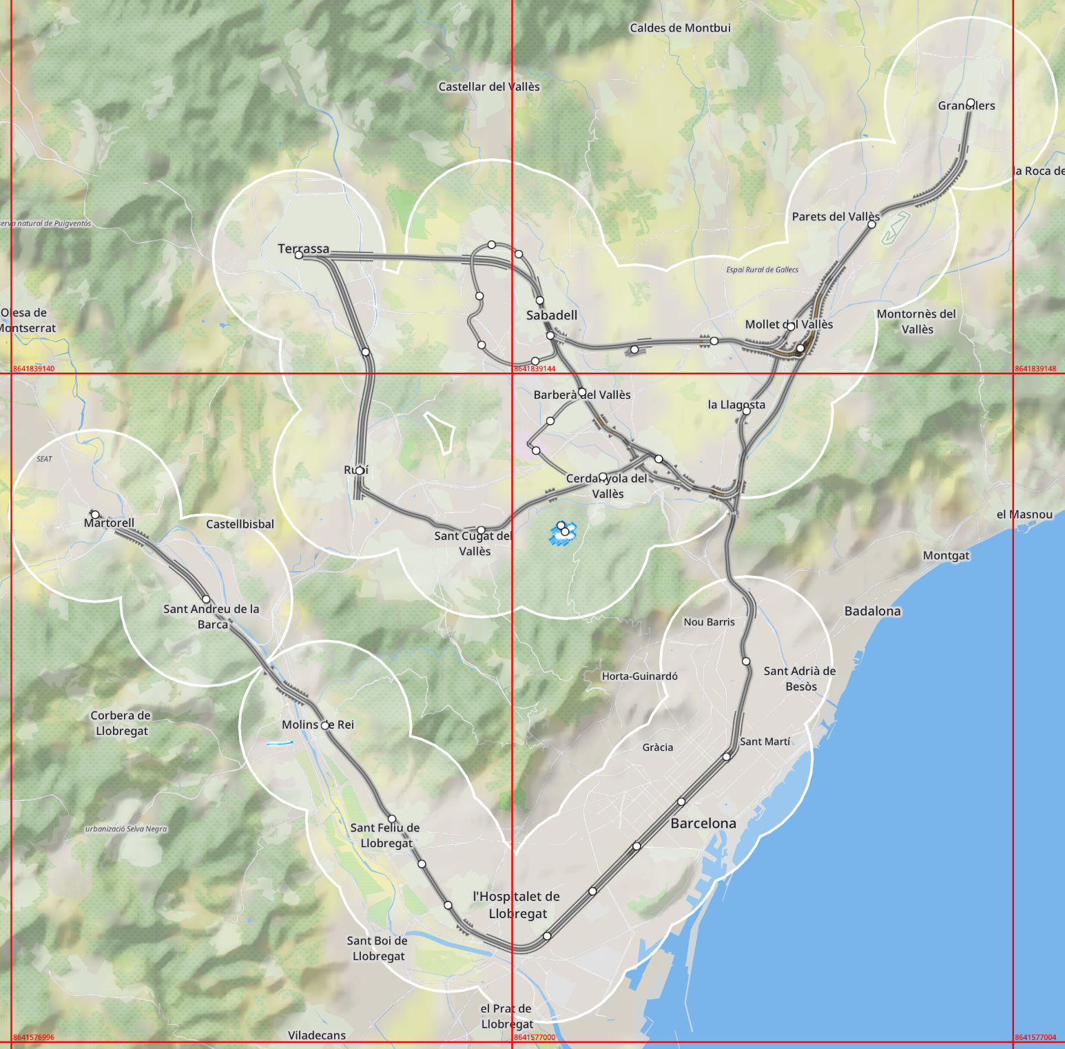
This fits perfectly well the with 1.12 pax spawn system, which is now based on map points rather than on stations. Pax spawn on map positions based on population density, and pick their destinations in the same way, independently of the presence of stations. This also means that they don’t have any station preference, and they must pick one of the stations in range of their position, both for origin and for destination. For now this choice is completely random, plus the origin and destination points are immediately discarded once a pair of stations are picked. I will look into making this more interesting in the future, but for now there’s plenty of (new) complexity in the 1.12 design.
There might be something else going on the screenshot… who can tell?
Disabling station satisfaction
Speaking of complexity, station satisfaction is disabled in 1.12. This system has always been confusing and half-baked, awaiting its turn to be revamped. The obvious choice would be to use it to inform pax station pick, but the definition itself of what is station satisfaction is not very well justified, and there’s other criteria which should influence pax choices more strongly. Since pax spawn station choice is random (for now), station sax really has no place at the moment. Pax satisfaction is still enabled and visible in all pax listings.
Station global pax stats
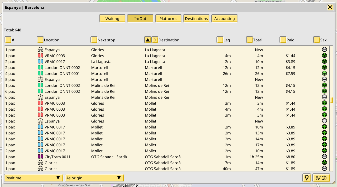
When I develop new features I often need debug UIs to help me test and refine them. Some of these test UIs end up being useful enough that they become part of the regular UI. For 1.12 it was vital to have a way to investigate pax flows, basically to take real time snapshots of the network-wide demand to/from a certain point or area. And what is a perfectly defined area? A station area. So now stations have gained an tab to inspect every other station and train in the map, and if a given pax in these objects matches the station, it can be displayed in the tab. That is exactly what the In/Out Realtime mode displays, with modes for origin and destination:
But sometimes it is also necessary to inspect this information over time, not just as a real time snapshot. Aggregating this kind of data is both CPU and memory consuming, but a simplified version can be implemented, and it is also supported:
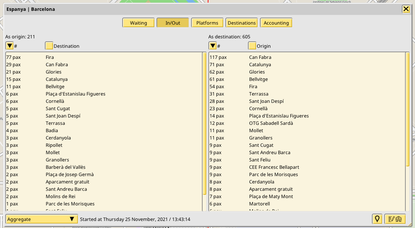
This new tab makes location and time based pax spawn very visible, which is very important for evaluating the rest of the features for March.
Multiple demand curves, with separate curves for origin time, destination time and distance weighting
February saw the implementation of a system of unbiased and fair pax generation based on population density, overcoming many problems given the scale of the data required to achieve it. In March the next two major systems of pax modelling were redesigned and reimplemented: time of week and distance.
Time weighted demand curves
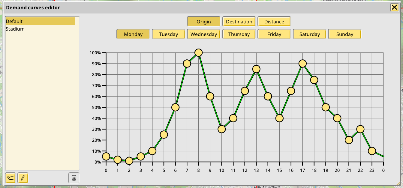
Time-based demand has been a signature feature of the game since its first version. 1.12 continues to support weighting demand based on the time of the week, with the same familiar system of 168 values, one per hour-day.
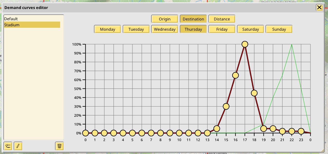
As a new feature it now separates origin demand and destination demand. This means it is possible to have some hours in the day where a certain area is generating more pax (higher origin demand), and some other times where an area is attracting more pax towards it (higher destination demand).
Distance weighted destination demand curves
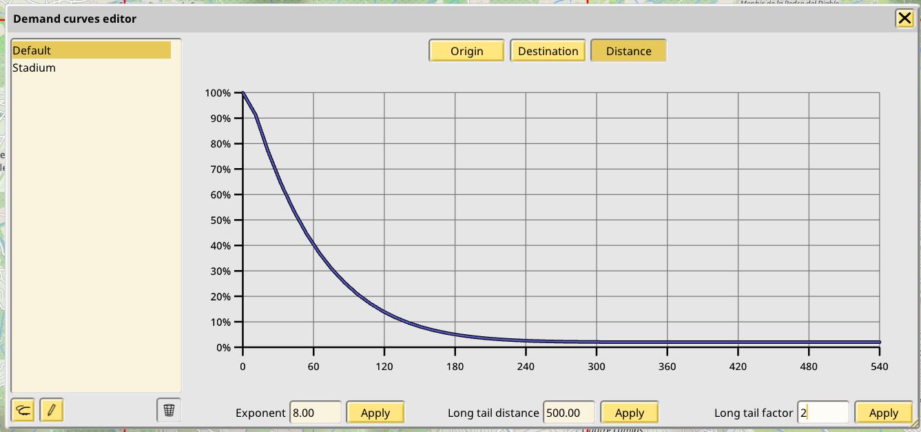
In addition to the time curves, distance weighted demand is also supported. But unlike in past versions, which used 3 hardcoded “flat” buckets of demand for 3 arbitrary distance limits, 1.12 supports a smooth curve. For now this curve is an exponential ramp-down, with 100% at 0 distance and an “long tail” of minimal demand at some distance, but I will probably experiment with a gaussian shape instead, to allow centering the 100% demand somewhere else than at 0, better enabling things like regional-focused saves.
Multiple, player defined curves
All the curves previously mentioned are player-defined, and an in-game editor is provided for them, as seen in the screenshots. This includes the default curve used for the bundled population map, which cannot be deleted, but can be renamed and modified completely if desired. It is even possible to set all its time demand to 0 to fully disable the built-in population.
Additionally, it is now possible to define multiple demand curves. When a new curve is created it is possible to redefine the full set of origin, demand and distance curves. This has been implemented as an additional level of CDF on top of the population density CDF.
But what multiple demand curves could be useful for?
Player defined POIs
For player-defined, population altering POIs! 1.12 allows players to create special buildings which add some population in a point of the map, and then assign a demand curve to it, controlling how the population of that point evolves over time and how its distance is considered as a destination. There’s not much to see in the current build of 1.12, since for now POIs are just specially formatted text labels:
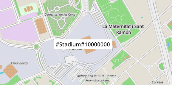
The finished system will feature a dedicated mode for creating these points, and they will be able to be colored and named normally, with dedicated UI for setting a population value and demand curve setting.
All tied together
An example of all of these features working together will make the systems clearer. In the following video (which you might want to watch fullscreen for the full detail) a POI has been created with a custom demand curve named “Stadium” and some exaggerated population value to magnify the effect for the video. The curve is displayed in the editor. It has distinct curves for destination (red) and origin (green) weighting. It models the demand a station could have, first becoming a very popular destination, then a couple hours later becoming a very popular generator of pax.
Under the curve editor and the POI label is the In/Out tab of a station whose area covers the POI (there’s 2 stations covering this POI, so it’s about to get completely swamped). The tab is first set to Destination mode, showing all the pax in the network who want to end their trips at it. At some point I change it to Origin mode, showing all the pax in the station who want to leave, plus all the others who already left and are in their way to their destinations.